Indicator Gauge Icon Legend
Legend Colors
Red is bad, green is good, blue is not statistically different/neutral.
Compared to Distribution
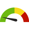 the value is in the best half of communities.
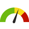 the value is in the 2nd worst quarter of communities.
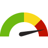 the value is in the worst quarter of communities.
Compared to Target
 meets target;
  does not meet target.
Compared to a Single Value
 lower than the comparison value;
 higher than the comparison value;
 not statistically different from comparison value.
Trend

 non-significant change over time;
 significant change over time;
  no change over time.
Compared to Prior Value
 higher than the previous measurement period;
 lower than the previous measurement period;
 no statistically different change from previous measurement period.
 Significantly better than the overall value
 Significantly worse than the overall value
 No significant difference with the overall value
 No data on significance available
People Living Below ALICE Threshold (UWSHR)
This indicator is archived and is no longer being updated. Click to learn more
This indicator displays the percent of the population who are below the ALICE Threshold.
Why is this important?
The Asset-Limited, Income-Constrained, Employed (ALICE) population earn above the poverty level but are financially insecure. The ALICE Threshold more accurately depicts a financial threshold representative of financial stability. The percentage of the population falling below the ALICE Threshold provides a more accurate picture of the population in need of support services.

Percentage of population
| County | Source | Measurement Period | Percentage of population | |
|---|---|---|---|---|
There are 20 County values. The lowest value is 31%, and the highest value is 60%.
Half of the values are between 39% and 55%.
The middle (median) value is 45.5%.
Data Source
- The ALICE Project
Note: This source uses Zip Code Tabulation Areas (ZCTAs) for its Zip Code data. Learn more
Maintained By: United Way of South Hampton Roads
Filed under: Economy / Poverty, Economy / Economic Climate, Community / Governance, Social Determinants of Health, Adults