Economy / Income Indicator
What does it measure?
This indicator shows the median household income. Household income is defined as the sum of money received over a calendar year by all household members 15 years and older.
Why is this important?
Median household income reflects the relative affluence and prosperity of an area. Areas with higher median household incomes are likely to have more educated residents and lower unemployment rates. Higher employment rates lead to better access to healthcare and better health outcomes, since many families get their health insurance through their employer. Areas with higher median household incomes also have higher home values and their residents enjoy more disposable income.
Location
Click Play button to show timeline.
Timeline:
2006-2010
2007-2011
2008-2012
2009-2013
2010-2014
2011-2015
2012-2016
2013-2017
2014-2018
2015-2019
2016-2020
2017-2021
2018-2022
2019-2023

Median Household Income
:
Comparison:
Measurement Period: 2019-2023
Data Source: American Community Survey 5-Year
March 27, 2026www.ghrconnects.org
Mapping is not available for this location.
2nd Worst Quarter
$55,646 - $66,718
2nd Worst Quarter
$54,945 - $63,625
Populations
Demographics:
Median Household Income (2019-2023)
Further Resources
Related Content for: Median Household Income
Source
Data Source
American Community Survey 5-Year
Note: This source uses Zip Code Tabulation Areas (ZCTAs) for its Zip Code data. Learn more
More Details
Visit the Help Center for more detailed technical notes.
Technical Note
The U.S. Census Bureau calculates 90% confidence intervals for American Community Survey estimates. Use caution when interpreting values with wide confidence intervals. Confidence intervals that are farther away from estimates in either direction indicate uncertainty due to small survey sample sizes.
The U.S. Census Bureau does not recommend comparing overlapping 5-year periods since much of the data in each estimate are the same. Use caution when comparing estimates for census tracts over time as these geographies are redefined with each decennial census according to population changes.
Last Update
2025-02-02
Maintained by
Conduent Healthy Communities Institute
Filed Under
Economy / Income, Community / Demographics, Social Determinants of Health
This indicator is archived and is no longer being updated. Click to learn more
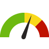
Indicator Gauge Icon Legend
Legend Colors
Redis bad,
Greenis good,
Blueis not statistically different/neutral.
Compared to Distribution
 the value is in the best half of communities.
 the value is in the 2nd worst quarter of communities.
 the value is in the worst quarter of communities.
Compared to Target
 meets target;
  does not meet target.
 Better than the overall value.
 Worse than the overall value.
 Similar to the overall value.
 No confidence interval data available.
Data Rollup
March 27, 2026
www.ghrconnects.org
Note: Clicking submit sends this layer to the site administrator who can choose to make it publicly available.
Map Layers
March 27, 2026www.ghrconnects.org